Book a demo
Let’s explore how Full Fabric can help you and your institution.
Let’s explore how Full Fabric can help you and your institution.

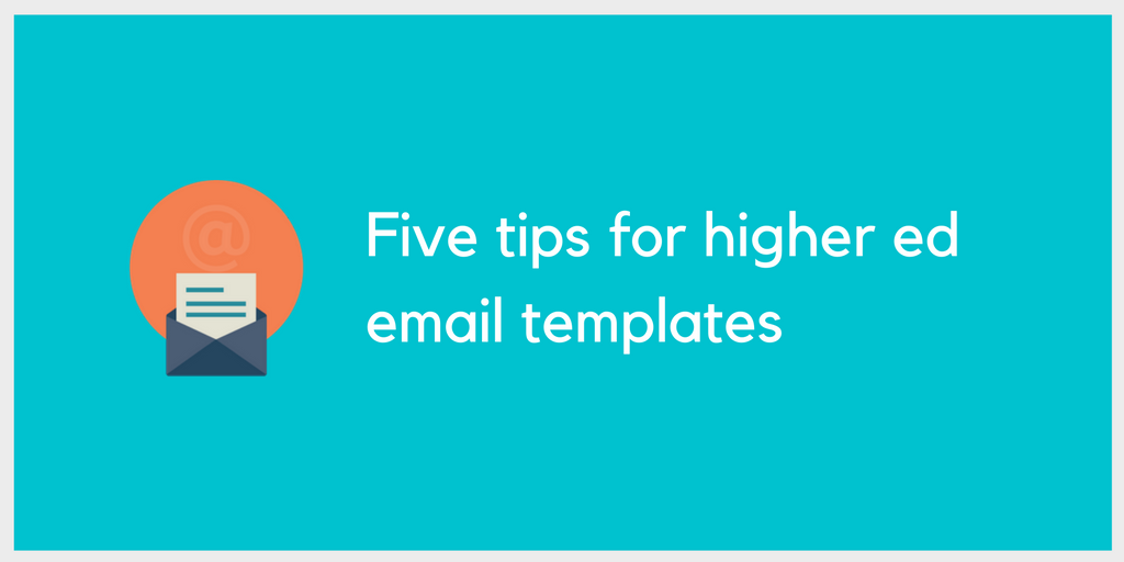
Here’s the first instalment of our new series of weekly, practical tips for university staff. We’ll be looking at ways admissions, marketing and recruitment teams can streamline their day-to-day activities and make their efforts more effective.
According to a study by Microsoft, people generally lose concentration after eight seconds, which makes for an attention span a whole second shorter than that of a goldfish. With such little time to work with, your emails need to be well designed to keep hold of your readers’ attention. Here are five ways you can fine-tune your university’s email templates to boost the readability of your messages.
Focus on an action
Design your templates so that your emails are focused on a specific action the recipient can complete. Examples of actions may include: signing up to a newsletter; starting an application; attending an event; or submitting a form.
Use a call-to-action button to give readers an easy and simple way to complete the relevant action. Make the call-to-action button prominent and minimise distractions: don’t use lots of unnecessary text or different font sizes and be sparing with images.
Use the inverted pyramid design
A reliable way of structuring an email is the inverted pyramid design. As this blog post by Vero explains, this structure comprises an image, a concise amount of text, and finally a call-to-action button.
With this type of design, the entire email builds towards the CTA, making it clear what you’re encouraging the reader to do once they’ve read your message.
Use images wisely
Think about which image would be most appropriate to illustrate your email. A well-composed, high-quality and relevant image can bring your email to life. On the other hand, a pixelated, non-contextual image can detract from the message you’re trying to convey. As HubSpot notes, ‘design should enhance your message, not distract from it’.
If you’re using a banner image, use the same or similar images across all templates to maintain brand consistency.
Personalise
Personalisation can give your emails a personal touch and make messages more engaging. According to HubSpot’s 2014 science of email marketing report, simply including a recipient’s first name in an email increases your click-through-rate from 5.8% to 7%.
You can do this by adding a personalisation tag to the body of your email. As an example, you could add a first name tag to the greeting preceding the main text of the message.
Create a text version
By creating a plain text version for every email template, you can ensure your email can still be viewed in the event of the rich text version not rendering. Your contacts will only receive the version compatible with their email settings (some may only receive a plain text version if this is how their email is set up).
Including the a plain text version also makes your email more deliverable, since the absence of this option can sometimes flag spam filters.
The development and maintenance of an in-house system is a complex and time-consuming task. Full Fabric lets you turn your full attention to maximizing growth and performance.